


Wine Bottle Packaging
Product Brochure and Bottle Back Layout
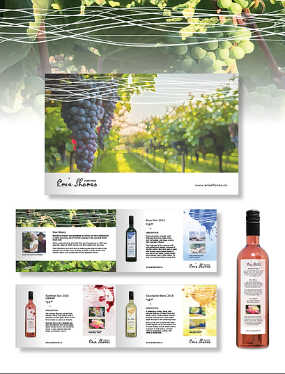
Erie Shores Vinyard
Erie Shores is a family run vineyard on Lake
Erie’s North Shore. They create quality award
winning wines at affordable prices. The owners’ son Andrew has joined the team and ensures a bright future for the business.
As competition grows, it is important for Erie
Shores to upgrade their branding and packaging, accurately representing the quality of wines they produce.
One possible direction is to combine their community passion with the business’ identity. By working with local artists, each bottle could be given a unique character while using a text layout template to provide continuity across the entire product range.
There is also an opportunity to do cross promotions with the artists and introduce Erie Shores wines to the artist’s clients. This would be done through print, web and social media as well as combined events and promotions.
Client: Erie Shores Vinyard
Services: Marketing and graphic design

Here is an example of an earlier design concept.
Examples of layouts that will be used for print, website, online store and social media.

Retail Display
It is important to make the vineyard shopping experience as positive and easy as possible and provide some information about each product. Allowing boutique staff more time to answer specific questions and provide product samples.

Boxed Lunch Packaging

For food products purchased and consumed in the vinyard, the belly band has a map on the top that provides information on where seating and dinning options are available throughout the vineyard.
Mary's Cupboad
COVID gave many of us time to rethink what was important. Family, tradition, and great quality foods are examples of what we value. Plus, I needed something to keep me creating and thinking.
Mary's Cupboard is what we came up with. It is based on classic family recipes (mostly from our great, great aunt Mary). The photo is actually the entire Campbell family in the 1930s. Aunt Mary is seated bottom left.
Who knows and one day this could become reality?
Client: Chris and David Thompson
Services: Graphic design
Mary's Cupboard Label Designs

Kim's Kitchen Label Design

Jamieson Vitamins 2022 Bottle Concepts

Kim's Kitchen Jams & Jellies
Her grandmother’s home cooking inspired Kim’s love of the kitchen, and she has translated that inspiration into a wide range
of gourmet homemade foods, jams, and jellies. She specializing in no–sugar–added products.
Client: Kim's Kitchen
Services: Graphic design
It's actually thanks to Kim that I was forced to develop this quick illustration style. There was no budget for photography and I had to just do it!
Jamieson Packaging Concept
In 2022, Jamieson celebrated it's 100th anniversary. They wanted to update their branding as well as labels and bottle styles.
Several options were created and put through market testing. The results of the testing provided valueble information and helped determine the way forward.
Clients: Jamieson Labratories Ltd.
Services: Graphic/packaging design

Here is an example of their packaging today. The decision was to not make major changes to the branding or packaging in 2022. COVID also made it more difficult and costly.
Kellogg Canada Cereal Packaging
Where it all started...
As a young designer, I had the great opportunity to work with the team of skilled designers at Whelehan Design. A firm that was located on King Street West in Toronto.
Clients included iconic brands such as Kellogg's, Green Giant, and many others.
Clients: Kellogg Canada, and Whelehan Design
Services: In-house graphic design
Kellogg Canada Corn Flakes Cereal Packaging
